AAC Website Redesign
For this project, I partnerned strategically to determine informtation architecture, designed the mobile web view of the American Addiction Centers flagship site, and supported efforts for refinement to unify styles across the site.
Date
November 2018
Skills
Website Design, Branding, Information Architecture
Tools
Sketch, Invision
Background
American Addiction Centers (americanaddictioncenters.org) is a network of addiction treatment facilities across the country. The mission of the company is to provide research-based quality care for those suffering with the disease of addiction.
This site is the primary platform by which people learn about the company, seek out care for themselves or their loved ones, and learn more about how various addiction rehab options.
My role was focused on building out the information architecture in partnership with our content team, ideating on various layouts for the different page templates, and high fidelity prototyping.
Problem
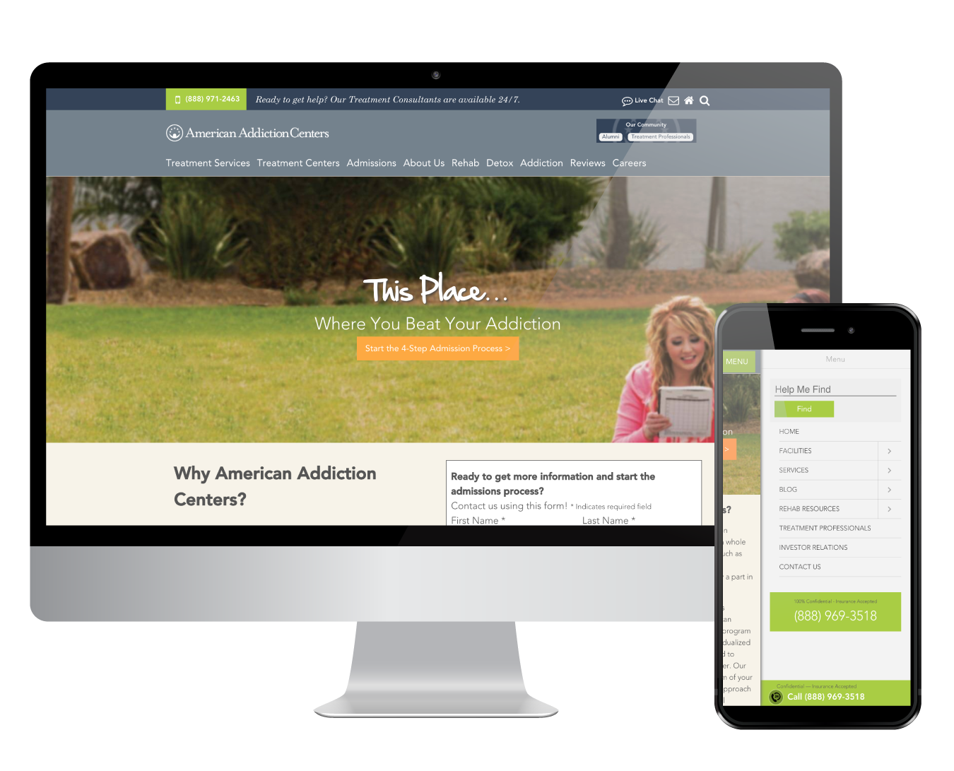
The company’s website has been updated in pieces over the years. This created a lot of inconsistencies across the site. With the company growing and wanting to re-establish its identity, we wanted to start from our front doors.
The goal of this redesign was to pull together the branding of the site, establish a more authoritative and medical feel and restructure the information architecture of the site. Upon analyzing the site further, I realized that the desktop and mobile experiences had many discrepancies, so we also kept it in mind to make sure the experiences were parallel to create a continuous user experience.
Finding addiction treatment requires a lot of trust and deliberation that we anticipate can happen across devices and various people. We wanted to keep that in mind to make sure that site users are able to access the same information regardless of device used.
Constraints
We were given very specific requirements regarding SEO strategies that we had to incorporate in the navigation as we worked on the Information Architecture. This meant pulling in keywords into the navigation and restructuring them to fit Google’s SEO best practices at the time. I worked with our Lead Product Designer to explore solutions for this through sketching out various options, while considering current navigational trends.
User research also wasn’t heavily adapted by the company yet at the time, so we resorted to scrappy ways of doing Usability Testing to make sure we were designing the right solution. This meant running guerrilla testing with friends and family, especially as we established the navigation.
Audit and Reserach
As part of the initial analysis, I did a UX audit of the site, focusing on the general page templates across it. I documented all the types of pages we had across the site, which included pages for company information, editorial content, drug-specific pages, listing pages for facilities, details pages and more. As I established the different page types, this helped us truly determine the scope of the redesign.
One of the first things I noticed was the differences between the desktop and mobile site architecture. We had already proven through our data that many of our users (~60% at the time) were multi-device users who viewed the site a few times with various levels of intent. My hypothesis was that the discrepanices between accessing info across devices could be a hindrance from customers to find information they needed.
I built out a storyboard around this and used it to validate my hypothesis. I had 5 friends test out the site for me on both desktop and mobile devices with a set list of tasks based on the storyboard and assessed the experience end-to-end and across devices. The research validated that it was more difficult to “pick up where you left off” especially when you started going across devices. Many of the participants I interviewed mentioned that they’d be likely to just Google what they needed — which while we were working on this to improve SEO and might end up on the Goole search, I determined this to be a potential abandonment risk across the end-to-end experience. This gave me qualitative data to support push for the navigation to be the same across devices as much as possible.
Competitive Analysis
Since addiction care and educational resources were very niche, I, along with 2 Senior designers, partnered to investigate various healthcare related websites. I focused on analyzing WebMD, TelaDoc and NIH.gov. The main goal was to analyze what worked and what didn’t work on these sites, especially from the lens of analyzing how they show a more authoritative tone through their site designs.
Some high level findings that we adapted to our final designs were around imagery and placement of call CTAs. We noticed that many of these sites utilized photos of authoritative medical figures such as doctors and nurses, as well as relateable imagery.
For imagery, we skewed more towards utilizing images of real medical professionals who worked at American Addiction Centers (made possible our internal image database) as we felt like many “relateable” imagery in the context of addiction could be triggering. As for the call CTAs, we noticed our current site focused on adding these in various places versus strategic moments of pause that we noticed on other sites. While we didn’t get to test this with customers, we hypothesized this could actually undermine credibility due to various patterns across various sites for pop-ups and upsells. We aimed to reduce these in the final designs.
High Fidelity Designs
Given that there were 3 designers on this, my seniors did majority of the legwork when it came to the individual page templates. They utilized various existing templates we had for similar content on our other sites. I was brought back in to establish a styleguide to help unify variations across the board.
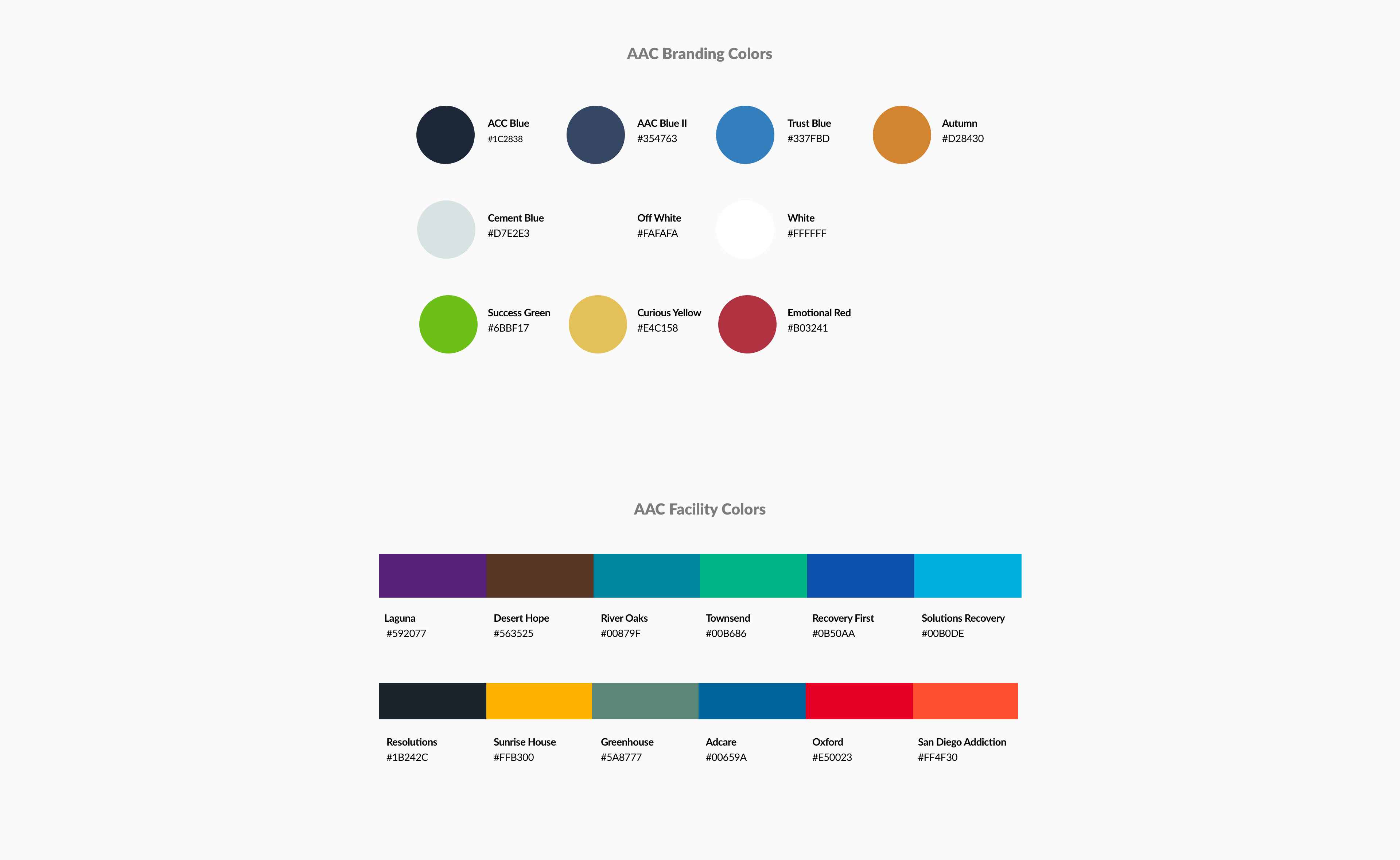
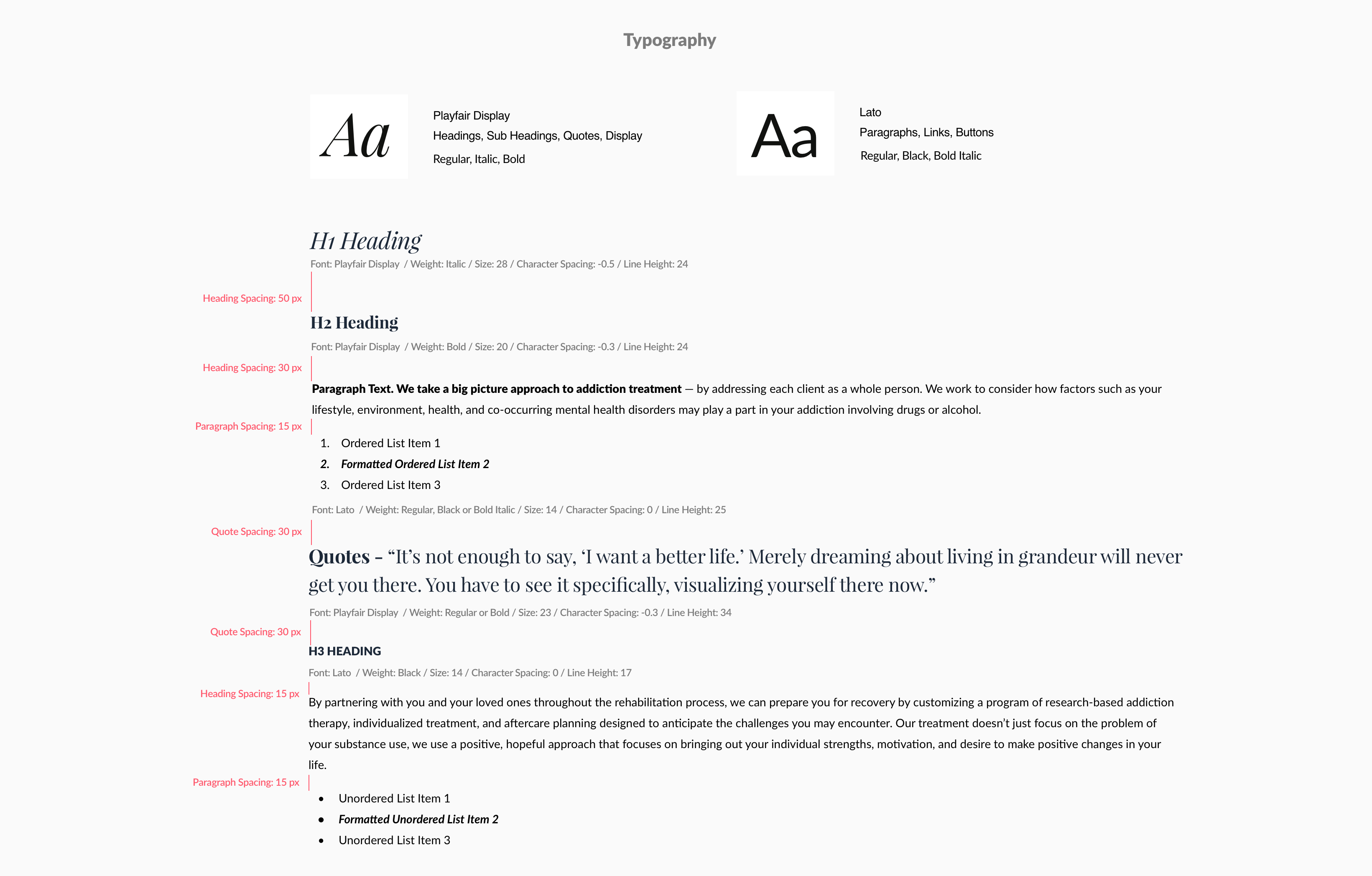
I used the existing spacing and grids established by our Lead Product Designer on the page templates he had created and consolidated these into a style guide that would help our developers establish universal styling.
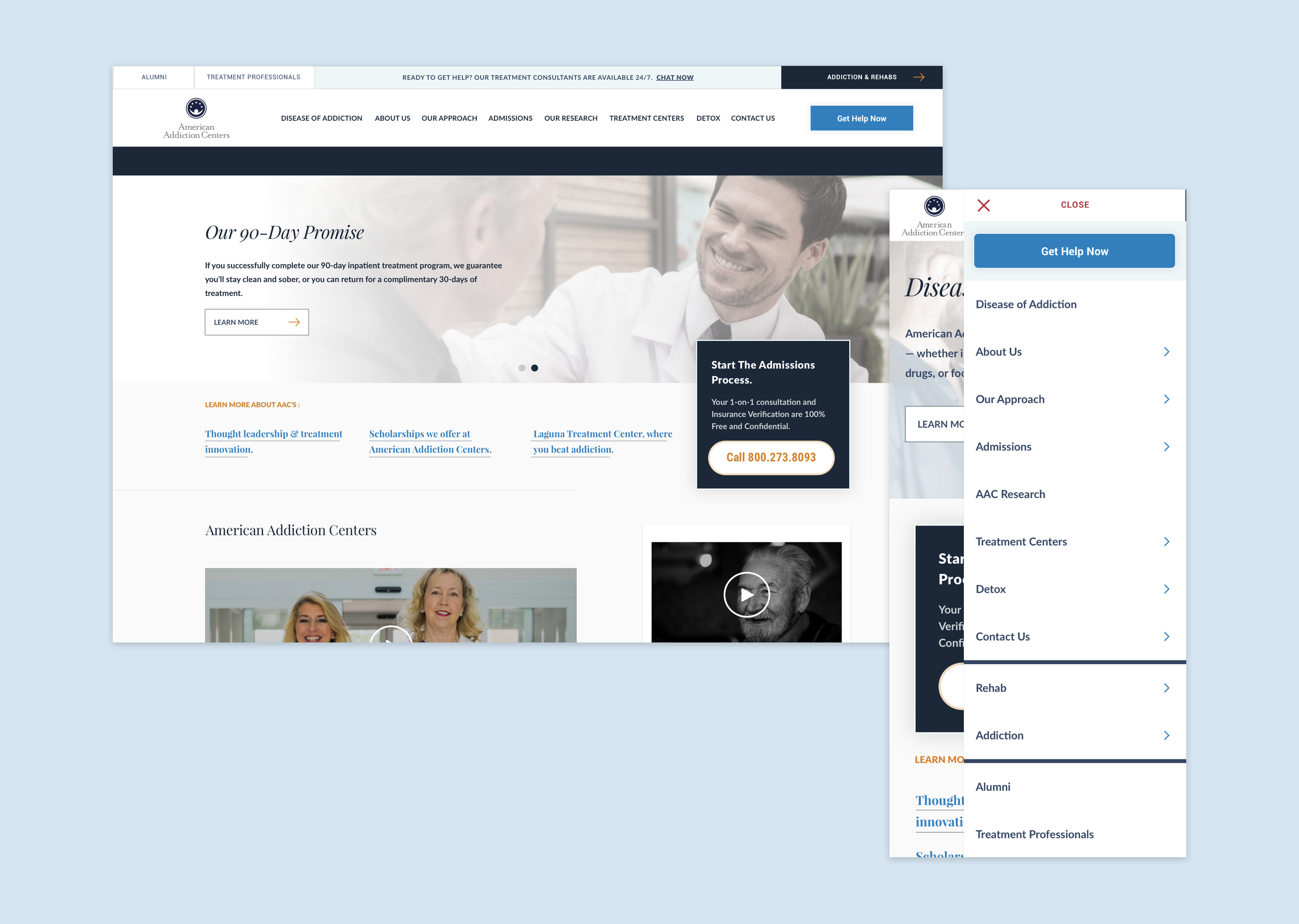
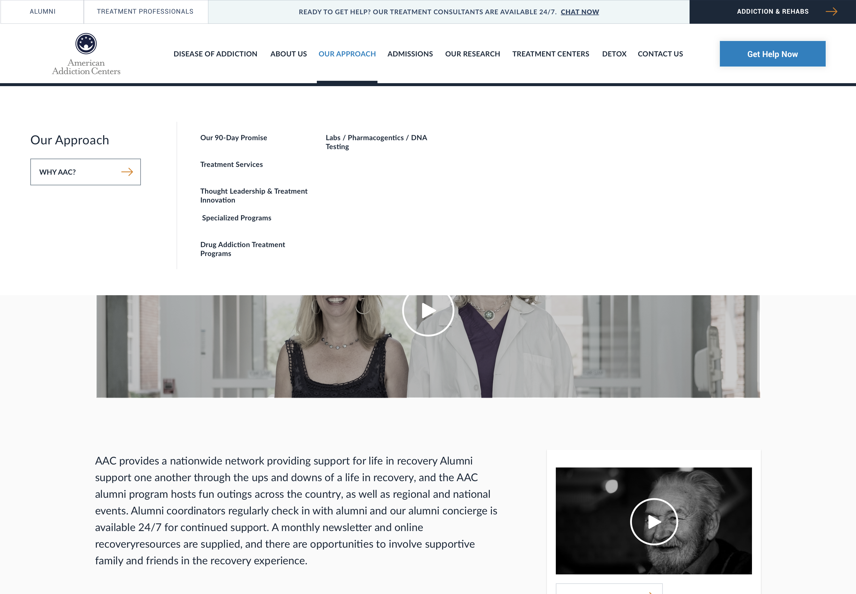
At this point, I was focused on translating Desktop screens to mobile, following the same principles I established around making sure the screens were more unified across devices. One of the biggest challenges was around the navigation. Given the direction from our SEO partners, this meant our navigation had to be wide on Desktop to house many of the categories we needed to include. I explored various ways of getting all the info in. I landed on a design that consolidated most sections on the wide nav that met SEO guidelines. Again, I sadly did not have the resources available to have tested this for usability with customers, but kept this focused on launching an MVP and worked with my Lead Product Designer to try to iterate on this moving forward in market as well through A/B testing.
Prototyping & Hand off
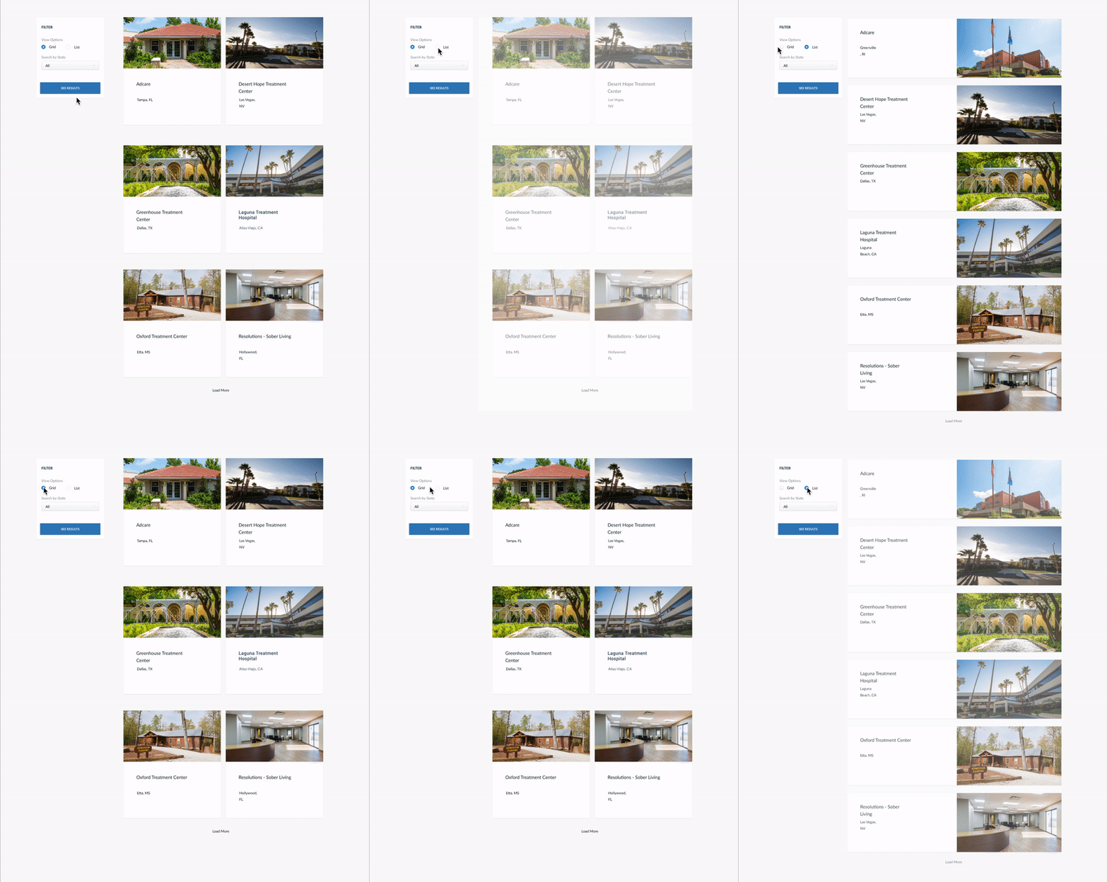
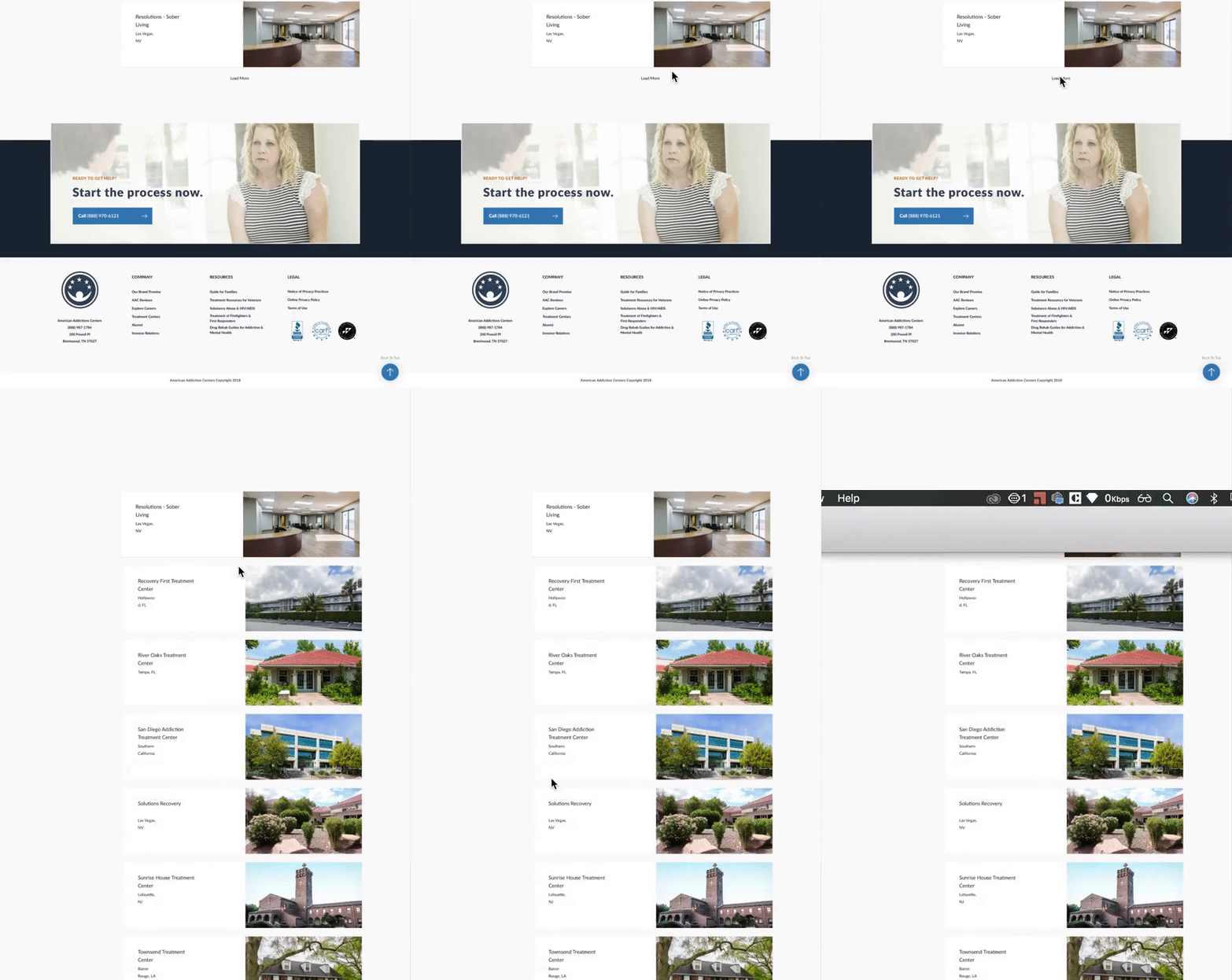
Upon handoff to development, I also worked on the protoyping for all interactive elements, including micro animations. For this, I learned how to use the app Principle for the project specifically. While we typically use InVision for most prototyping needs, we needed something to demonstrate specific micro interactions that we thought would help cue users to how parts of the site works.
Outcomes
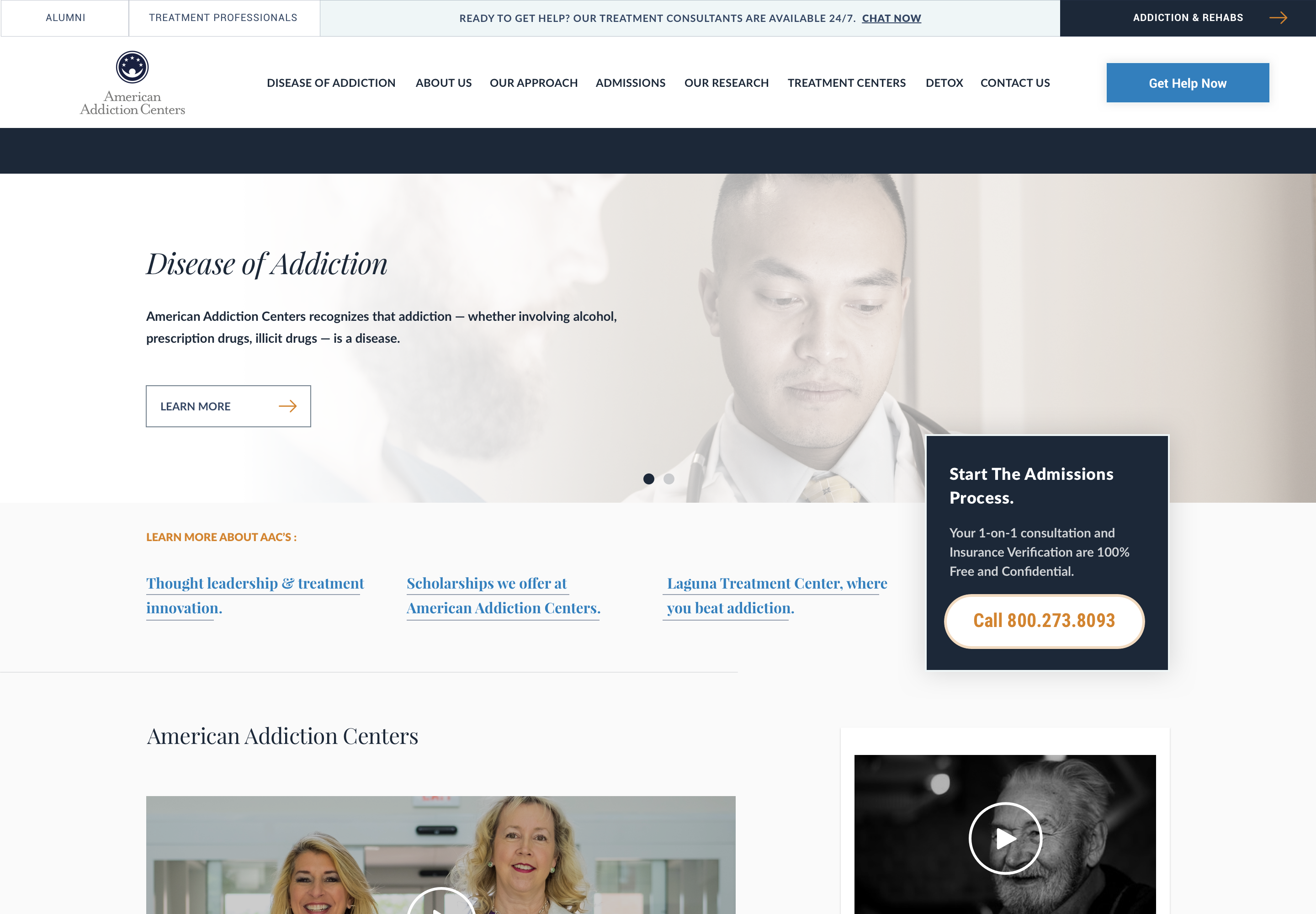
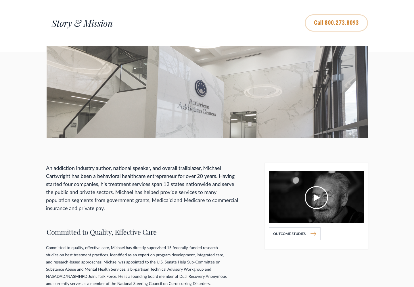
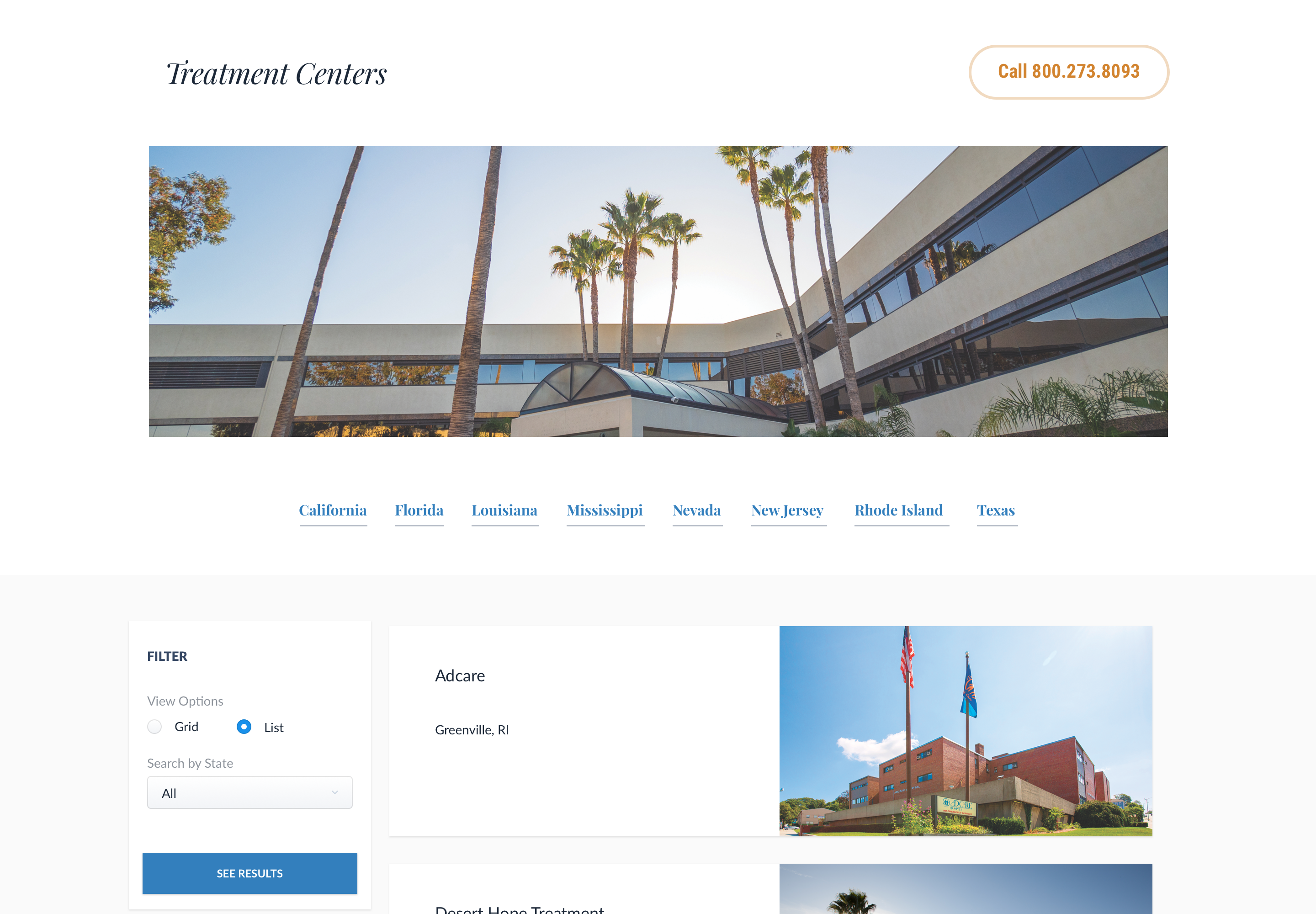
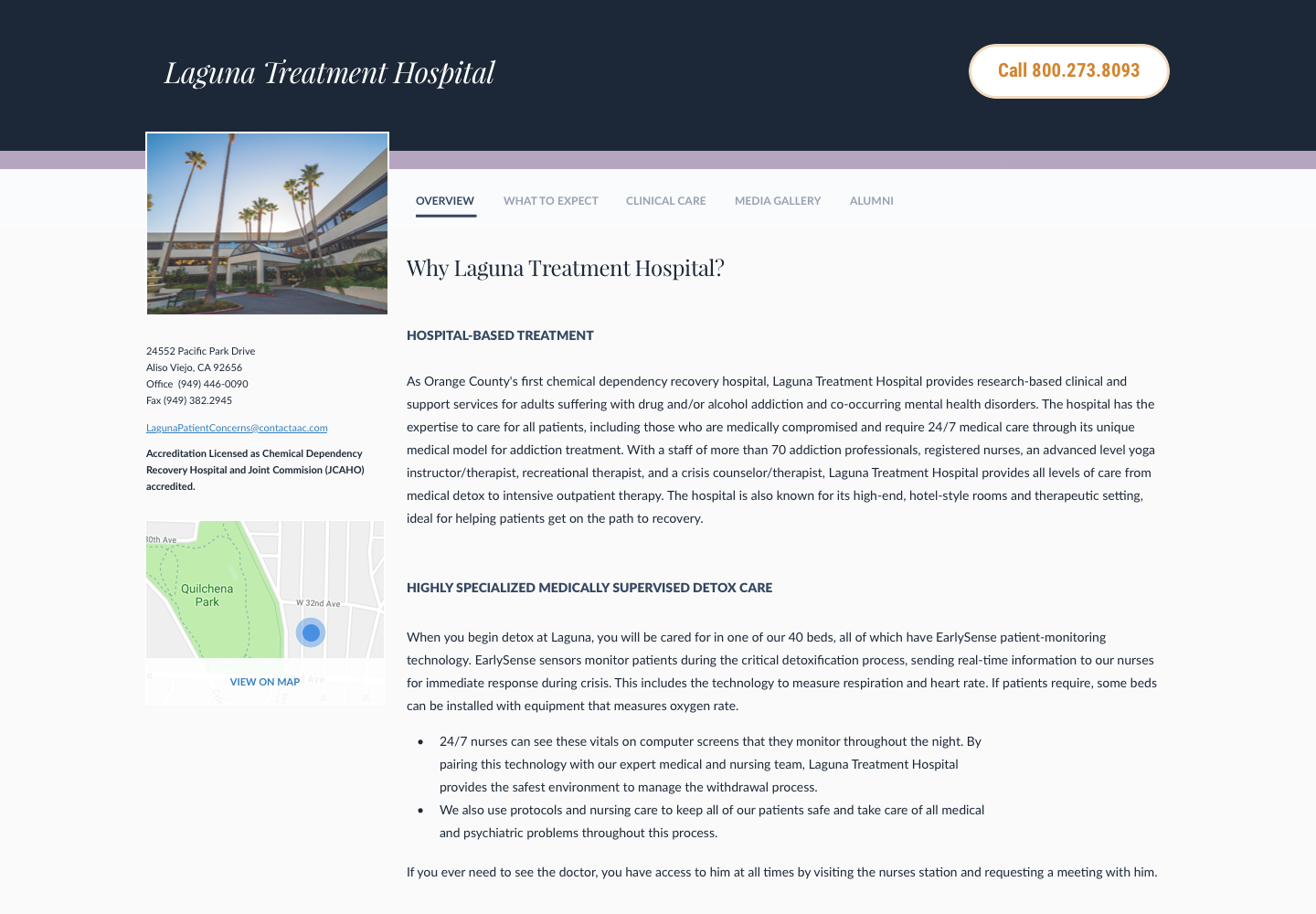
As I left off with this project, the site was still under development. After development, it was intended to go through User Acceptance Testing and adjusting the site based on those results. I didn’t get to gather quantitative results for this project. However, here’s some highlights of the pages we designed for this.
Takeaways
Looking back on this project, here’s a few things I learned:
- Guerrilla user testing can come in really handy! While different organizations value design at different levels, having some sort of validation from people who aren’t as close to the project can really help remove bias and give direction on how to proceed.
- Working with cross-functional partners and understanding their goals is so important and should be done as early as possible. Because the redesign was heavily in service of our SEO goals, it became even more important for me to partner with our SEO specialists to make sure all requirements were being met. This was a great experience for me to help negotiate goals across the two functions and find solutions that could meet both.
If I had more time on this project, I think I would have looked at potentially pushing more on validating with customers as early as possible… even if it meant further scrappy user testing. We were approved to do “Acceptance Testing” after the project was developed fully, which could be an expensive mistake if things didn’t work out. I also would have loved to learn more about business metrics and what the true impact of this would have been!
