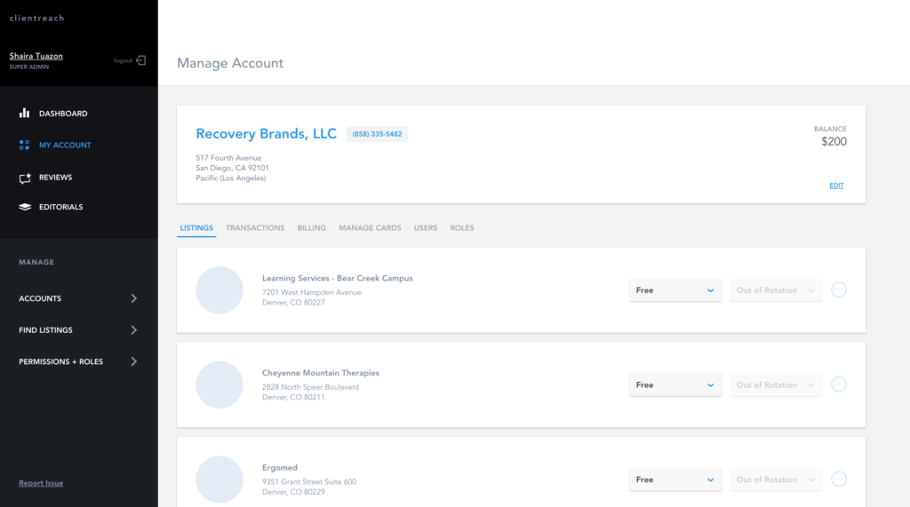
ClientReach Account Redesign
For this project, I focused on customer needs within an existing ad management platform to simplify the user experience, highlight the most used features and reduce call drivers.
Date
June 2018
Skills
User Research, Product Design
Tools
Sketch, Invision
Background
ClientReach is a cloud-based product that serves as an ad management platform. Our websites on addiction and mental health get millions of unique visitors each month and ClientReach connects addiction rehab centers to patients seeking treatment by providing ad placements. This dashboard allows users to view all listings, monitor analytics and make changes.
Our internal Client Success Managers (CSMs) are the primary users for this platform, with rehab facility managers running ads on our sites being secondary users.
Problem
The minimum viable product (MVP) for ClientReach was launched in 2016. It was more so focused on building out the API for our ad servers and the UI side of things was rushed. It didn’t have the worst user experience, but some decisions initially made for the app was not developed as designed due to a focus on speed.
In early 2017, our Director of Business Operations approached the Product Design Team bringing up a concern about needing to figure out “how to increase user engagement in the application.” It was brought to our attention that from a business perspective, due to the expense that comes with building out a web application, it was important that we make sure that users utilized it to its full potential.
The external users were not using the application enough for their campaigns.
Research
ClientReach’s main users are our internal Client Success Managers (CSMs) who utilize the web app as a sort of content management system and data analytics platform. External clients are secondary users and our CSMs communicate directly with them. I looked into Google Analytics to see general user flows, wherein I found that there was a lot of clicking around different tabs. Our analytics were not very in-depth so I had to make some assumptions prior to further research. With this, I built out a hypothesis to help me frame the questions I would ask them to develop a better understanding for the problem I was trying to solve. The layout of the app was confusing to external users, so they couldn’t find what they needed when they used the app.
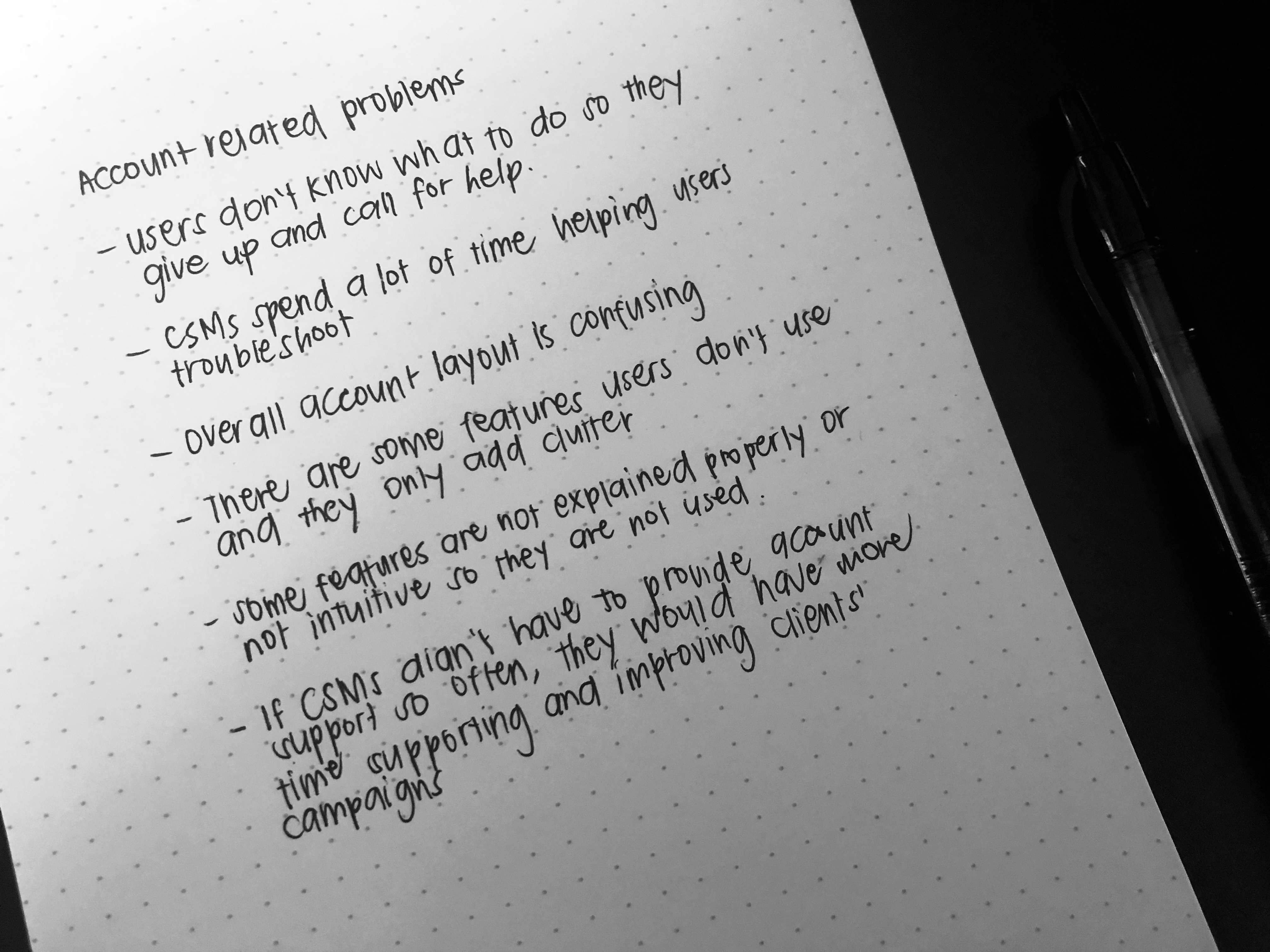
To better gain insight on how users utilize the app, I conducted interviews with the Client Success Managers. It was evident throughout these interviews that external clients heavily relied on the CSMs for many tasks related to billing and campaign analytics.
It is important to note that external clients were given access to the ClientReach web portal and were able to accomplish these tasks through the web app. The dependency seemed to be a result of an older workflow that existed when the app wasn’t fully developed and things were done manually. Aside from that, CSMs noted typical complaints or questions that external clients brought up. A lot of them were related to not being able to find things in the app.
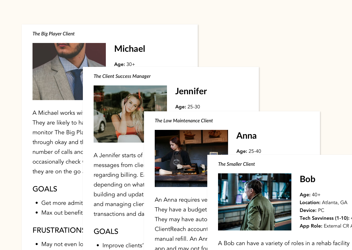
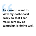
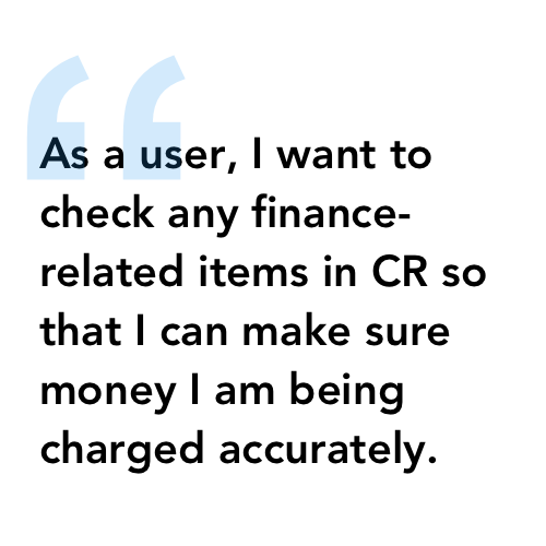
I went back to gather further information through Google Analytics. I looked into what pages were most visited by users to see what features were most utilized based on user behavior. With all of this data, I established the personas and user stories to drive my solutions.
Wireframes
With a better understanding of our users, I came up with a couple of low fidelity wireframes that could meet our requirements regarding the main user actions along with solutions for the pain points. Layouts were inspired by looking into various account pages and other similar profiles from products in banking, social media and mobile applications.
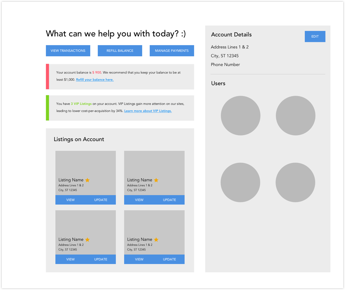
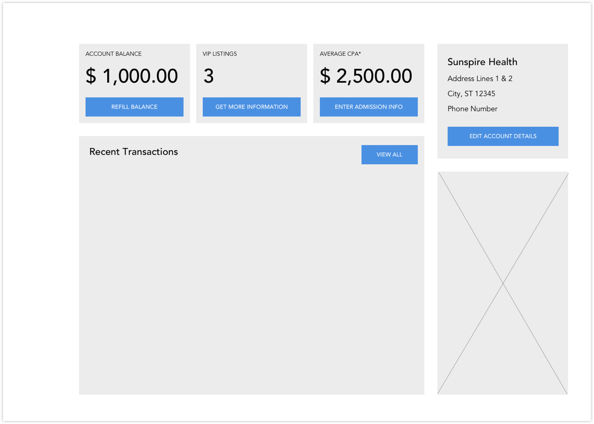
These were the two layouts where we found some worthwhile elements that could provide solutions to the problems we’ve identified earlier. Our Product Design Lead provided me with feedback to help guide which way to take this redesign.
Solution
After selecting the most optimal solution, I created a high fidelity prototype following proper branding guidelines and modular elements that currently exist in the app. This layout brings out the main actions identified through the research. I also added in some features that can help educate users about how their campaigns are doing and how to maximize their investments.
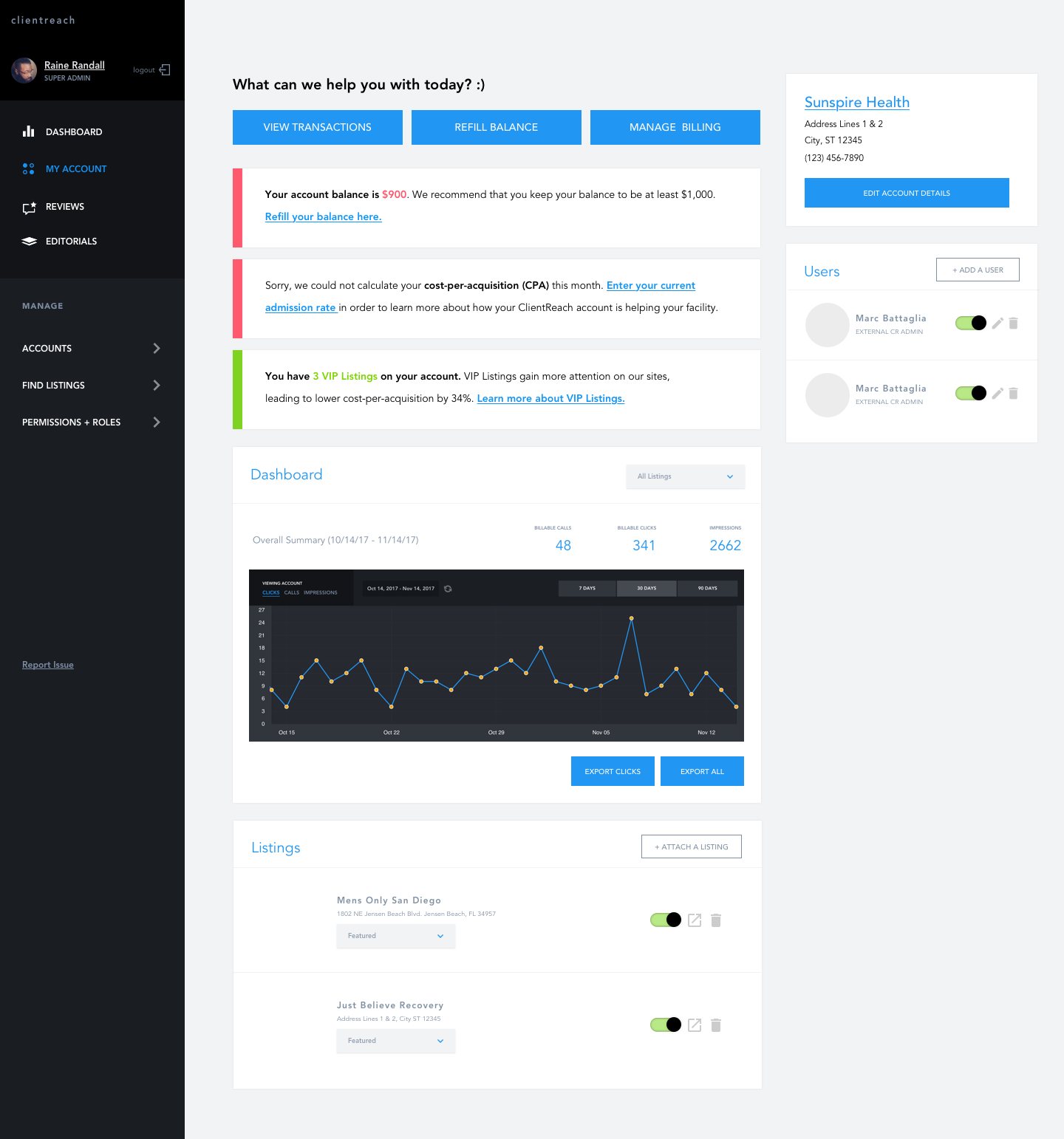
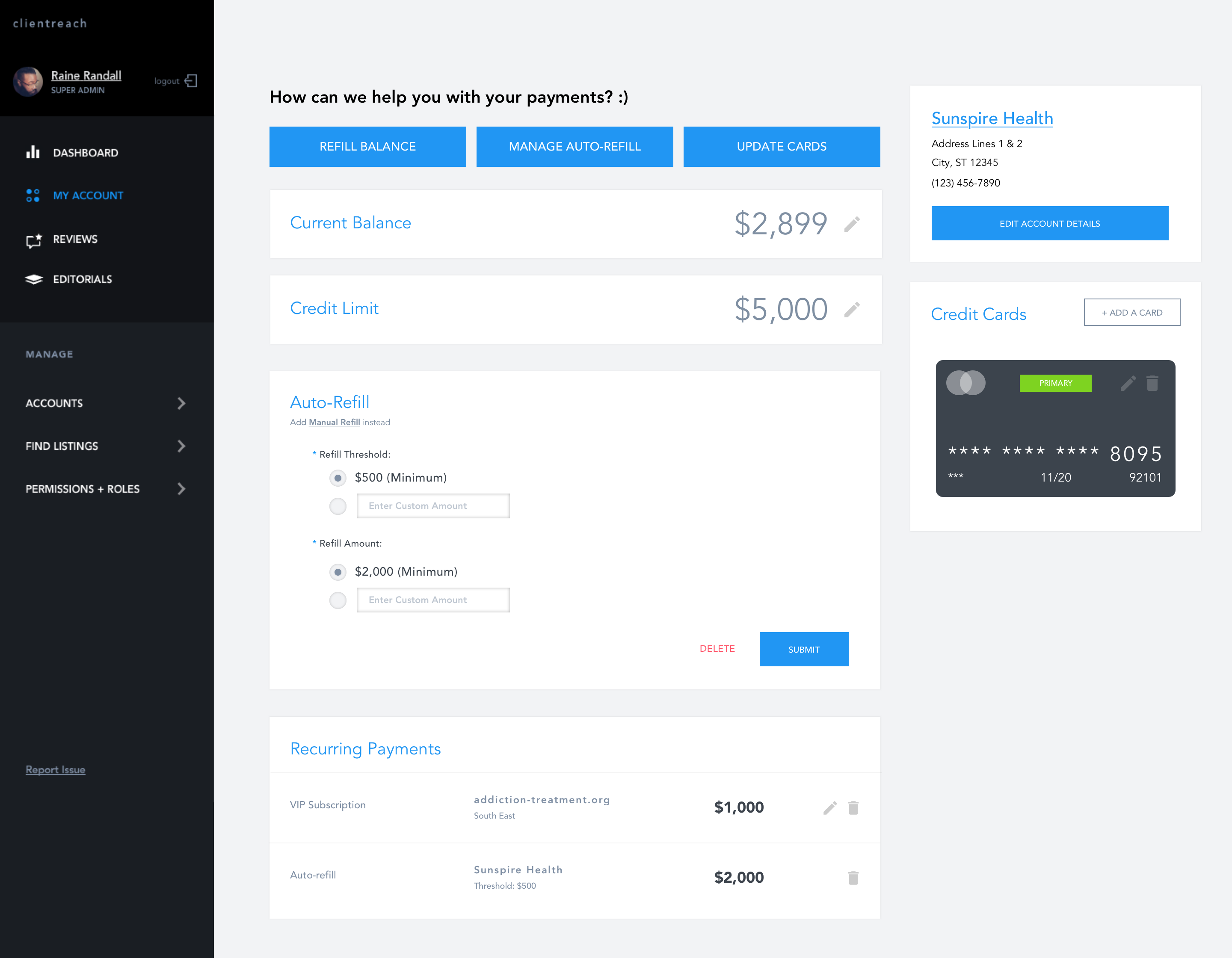
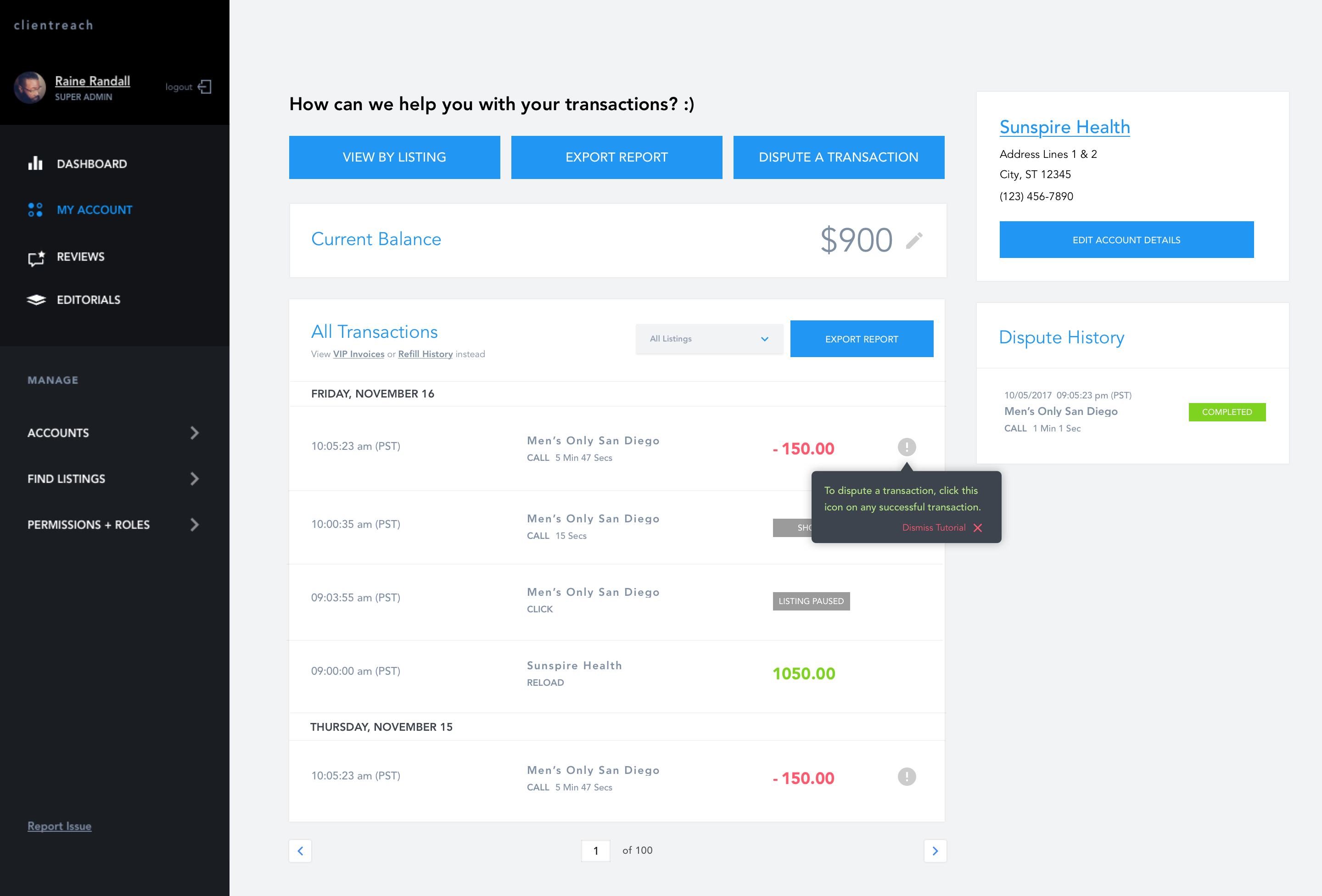
The new design is a solution for the workflows of both internal and external users. The interface was designed to emphasize the actions one could do on that page. I did that to give a sense of empowerment to the user, as opposed to the dependency they have always felt while using the app in its old layout.
In order to transition users in, the first interaction with an action led into step-by-step tool tips. This served as a similar hand holding that CSMs without actually using their time for the process. These established a pattern so users can go back and easily figure out how to do it on their own. More importantly, the new layout grouped more similar elements together to create a more cohesive app flow. For example, main actions related to listings were all put on the right side for all possible iterations of it across the board, following the user pattern reading from left to right and finding the conclusion at the end (which is the right).
Outcomes
Unfortunately, we didn’t have full analytics on this app that can provide me with quantitative results related to our external users, due to the level of investment in the platform at the time. The only metric we really based this whole project on, which was the driver for our Director to come with this, was based on number of unique users visiting our site. However, we had data from our CSMs and the calls they receive from these clients. Based on some quick analytics we did on the general call themes, we found a reduction of 25% less calls related to How to make changes that were available on the dashboard.
Takeaways
Overall, this was a great project that I felt like was the first time I truly got to drive from end-to-end as a Product Designer. It was awesome to really discover my own personal design process through this. Here’s a summary of some things I learned along the way:
- Sometimes the problem you assume is not the problem you need to solve for. Our Director came in with the problem of “increasing user engagement” with the app but didn’t quite understand why this was a problem in the first place. As designers, it’s our job to not only understand the business need at hand (ie, make sure an app that was expensive to build is being utilized) but also that of our users and finding ways to marry those together. The user interviews I conducted helped show more of the problems that could be solved with the UI!
- It’s important to understand the needs of a representative sample of your user base. While I only had the opportunity to do user interviews with our internal users, I was able to learn more about our external users through them. I recognize there is still some level of bias here, but it gave me a good starting point!
- Data, data and data. It was at this point that I truly understood why data was important, especially when it comes to pushing on business cases. It was hard for anyone to measure or understand what was even going on in this space due to lack of data.
Big shoutouts to my mentor, and our Lead Product Designer then, Raine Randall, who coached me through this whole process as I picked up an E2E piece all on my own. While I’m extremely proud of this project and its outcome given what I had learned, here’s a few things I would have done differently.
- Look for more data upfront. When not available, don’t be afraid to ask for it, so that someone with that expertise can at least establish initial data. It would have been great if we had better measurements of success here that I could have used to validate, but it was a little too late for us to measure data before the launch when I had presented the redesign.
- Share early and often. I would have loved to get more feedback along this process! I mostly shared my process with my Lead Product Designer but getting broad perspective always leads to better designs. I wish I had time then to share with other stakeholders like our Director of Business Operations and our CSMs before landing on a final design.

